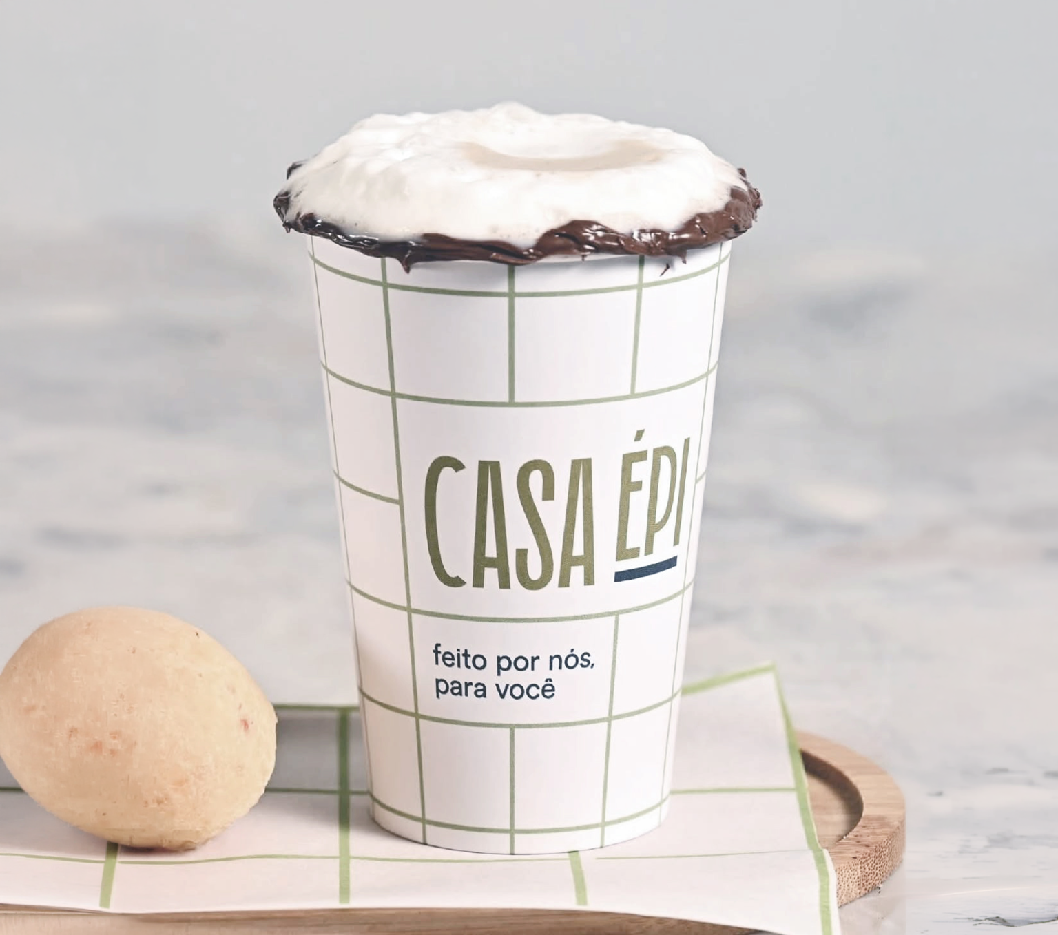
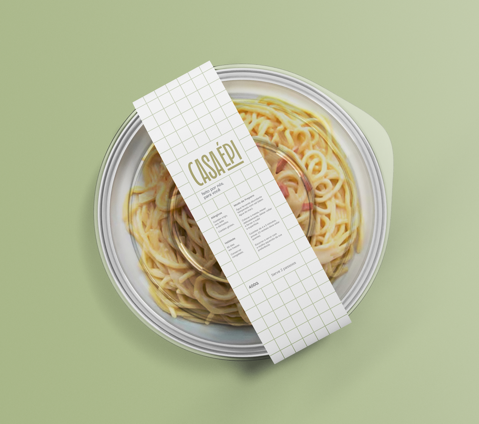
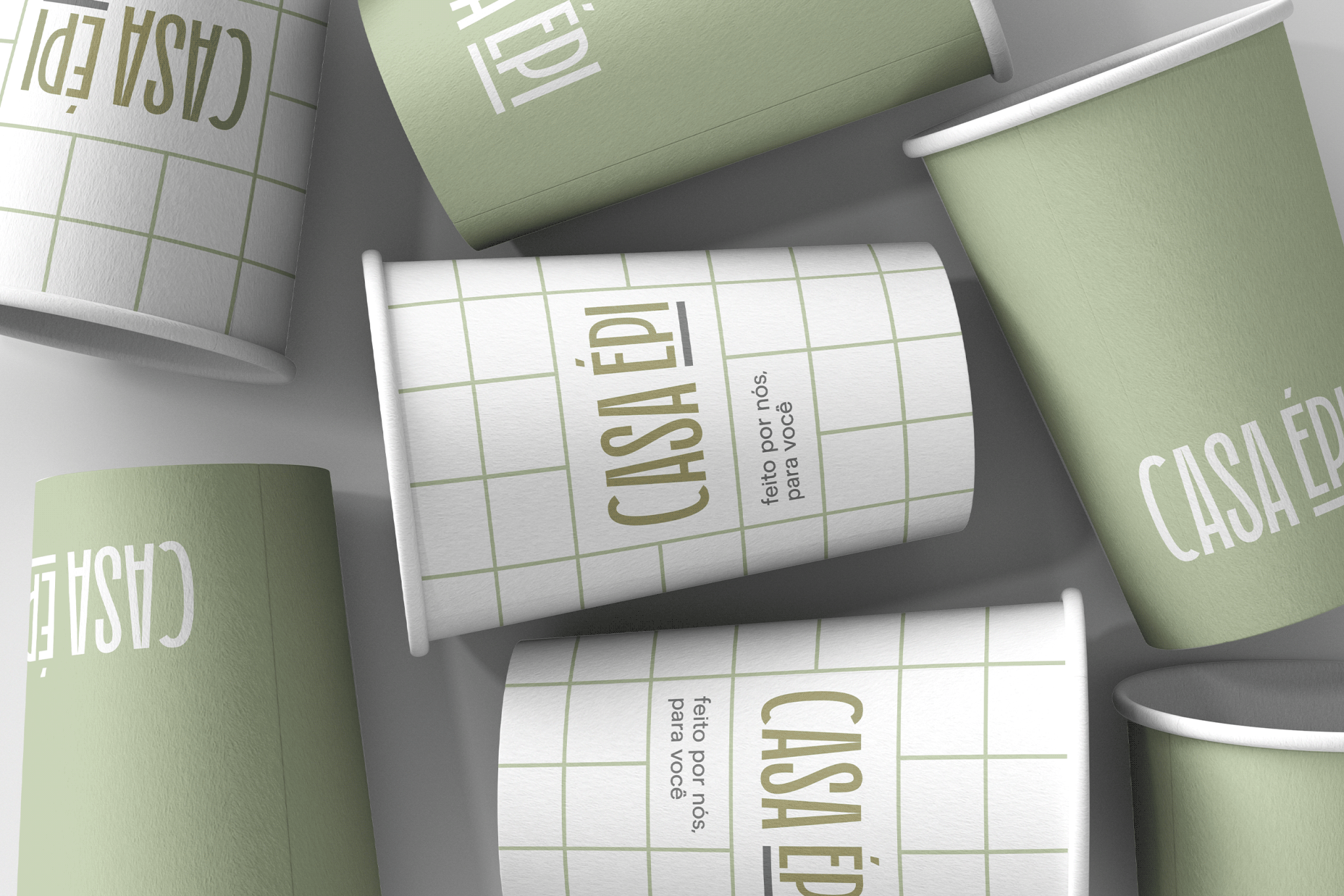
Casa Épi is a Brazilian food brand and café rooted in the traditions of Minas Gerais and Goiânia, bringing family recipes and a contemporary approach to everyday gastronomy. The brand offers fresh, handcrafted food, from artisan bakery and confectionery products to ready-made meals. Built around the idea that food is an expression of affection, Casa Épi celebrates care, freshness and the small moments shared around food. At the heart of the brand is a simple idea: made by us, for you.