Personalised Training for Those Looking for More than Exercise.
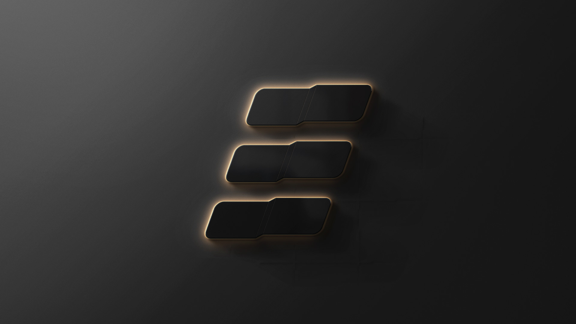
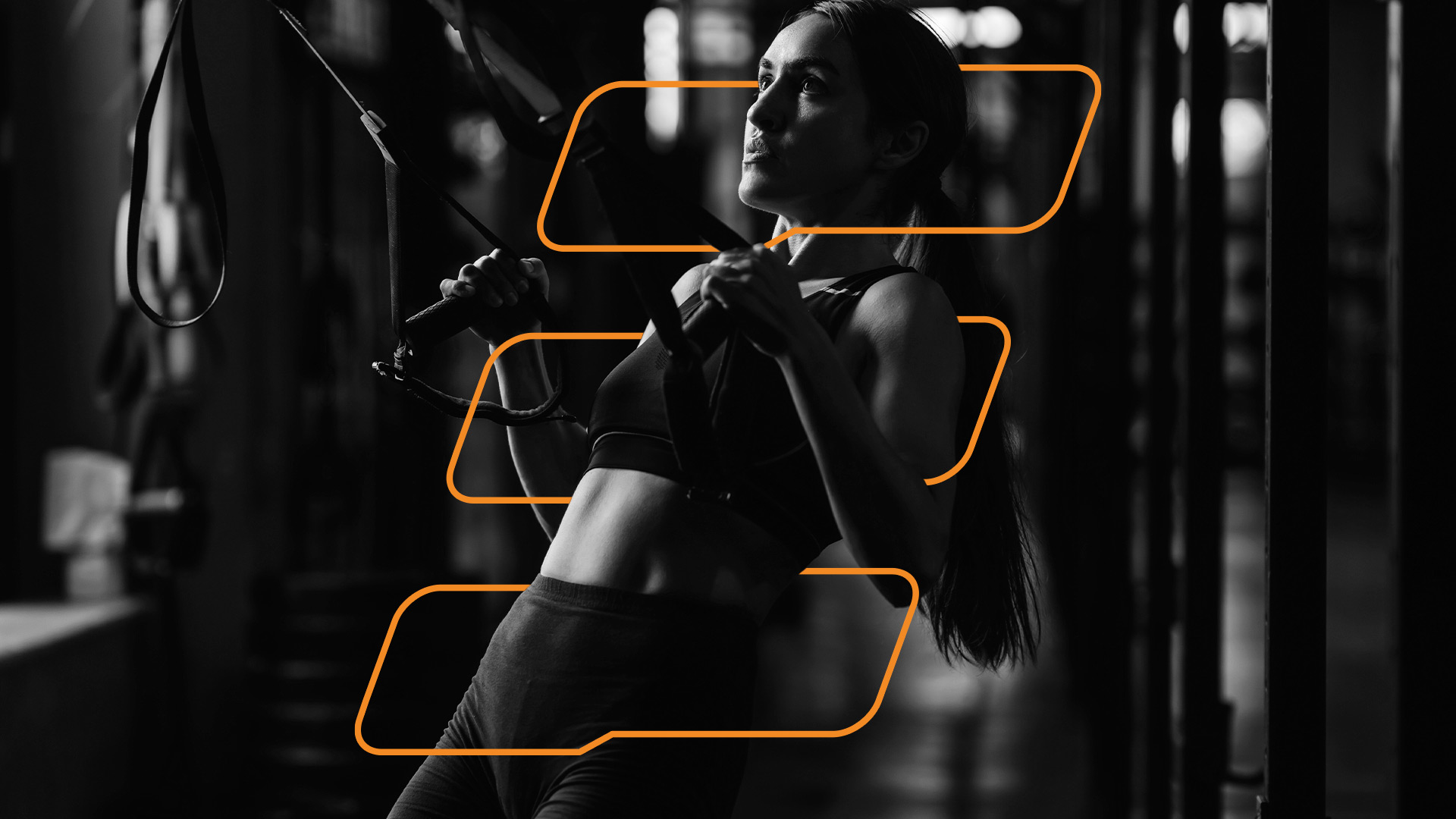
The visual identity was built around a simple geometric mark formed by three stacked bars. Together, they suggest the letter E for Equilibrio, while their angled composition introduces a sense of movement and progression. The balance created through the repeated forms also references the studio’s central idea of equilibrium and constant movement.
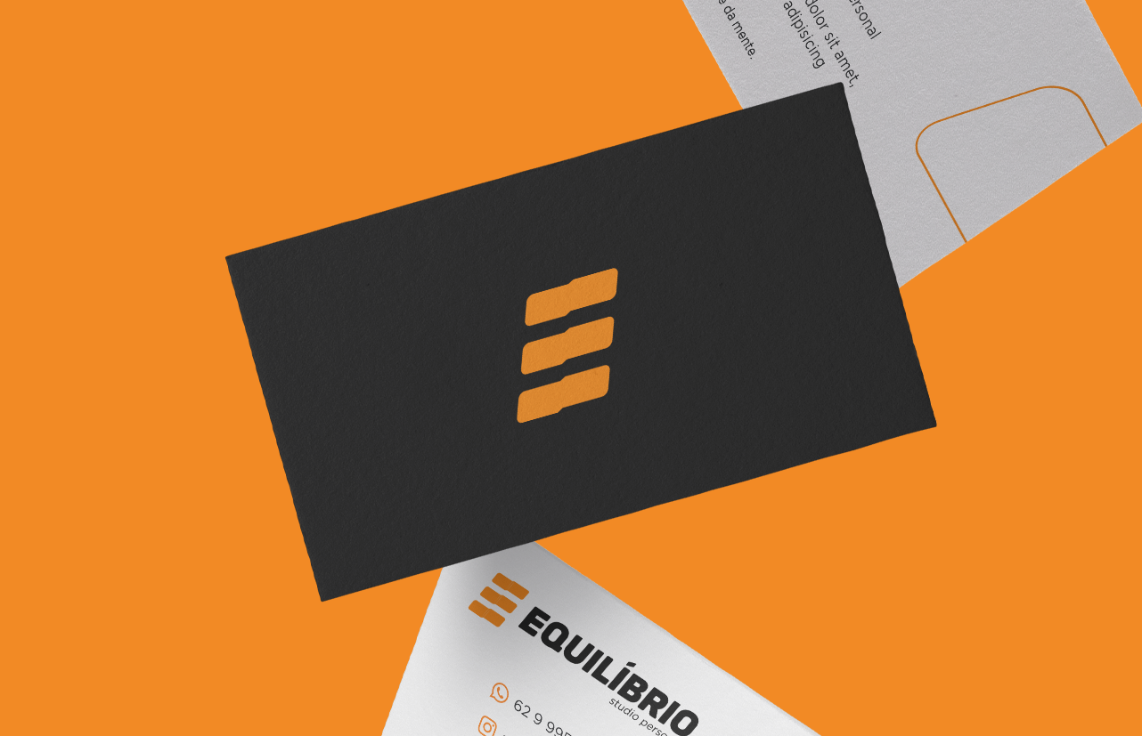
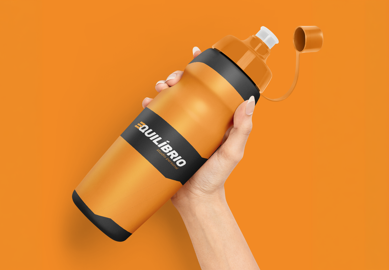
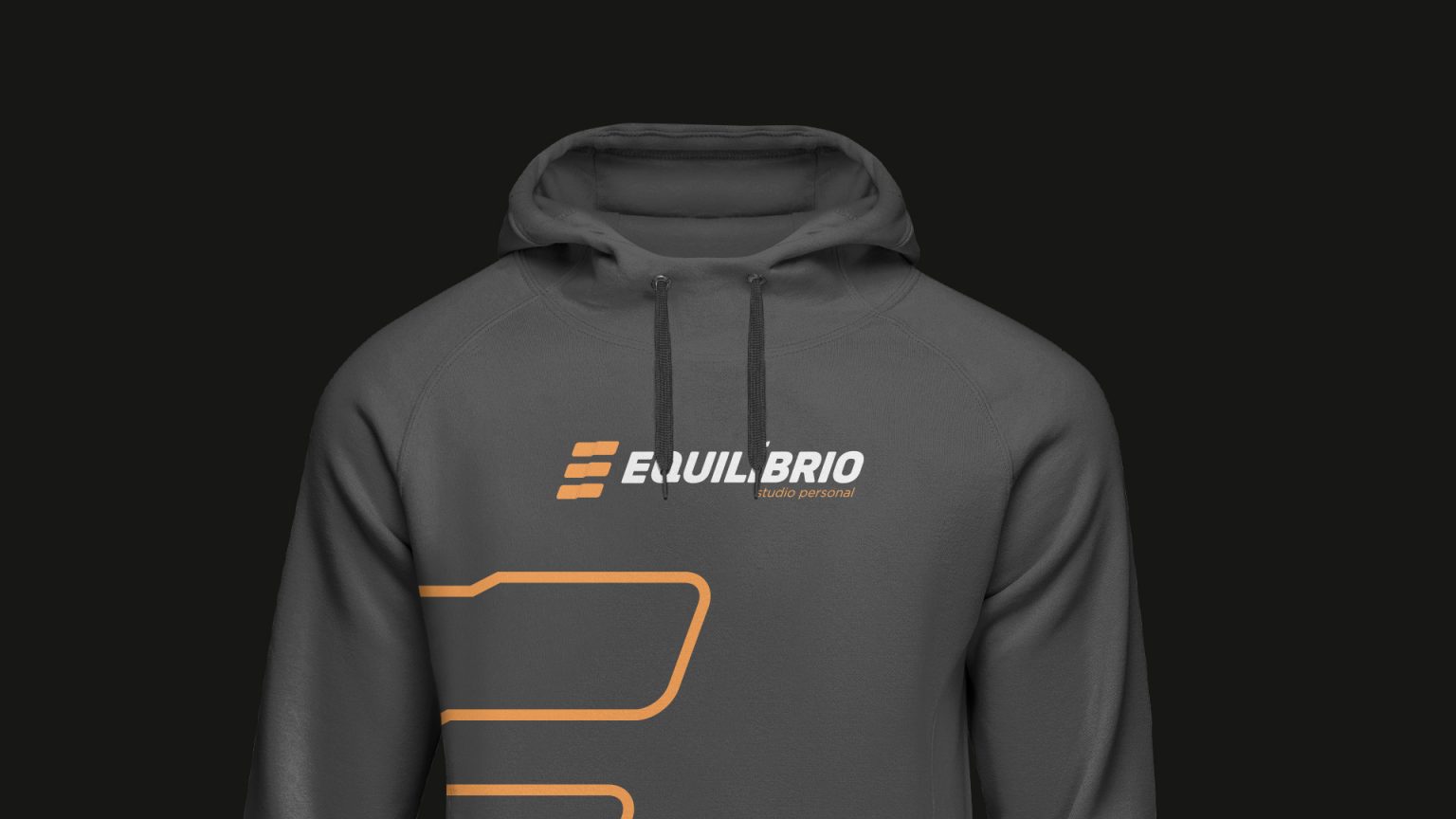
The wider brand rollout was designed to feel vibrant and energetic while maintaining a grounded and solid undertone. The identity was extended across a small set of selected applications that reflected the active and health-conscious lifestyle of its clients.
A visual identity built around balance and movement, reflecting the business's approach to strength and wellbeing.